The client wanted an e-commerce site to launch a new sustainably-made skateboard helmet. The mission is to promote the importance of helmet safety and mental well-being.
Hi-Fidelity desktop. See mobile version at end of study.
PROJECT NAME Thrive Helmet Co.
ROLE UX/UI designer, researcher, user testing
TOOLS USED Figma, Maize, Asana, Google sheets, Illustrator, Photoshop
DATE 03/06/2023
OVERVIEW
Thrive Helmet Co is a new online retail company aimed at helping skateboarders. It sells helmets made from recycled plastics. It also provides exclusive content to build one’s mental strength and encourage a strong sense of community.
CHALLENGE
How can we incorporate the multiple aspects of the client's request? To design a website that can cohesively sell helmets (and other Thrive merchandise) combined with a strong emphasis on safety, mental health and community.
The deliverables requested:
User Research & Information Architecture
Prototype of Website (high fidelity)
Branding: Logo, design guide
My team had 3 weeks to design a website (for desktop and mobile)
APPROACH
Utilizing the “double diamond” UX process, we developed a plan.
Research: We began with surveying the target audience, skateboarders ranging in age from 19-35.
Branding: We created a logo and branding guide for the client
Usability Tests: We conducted user testing on our mobile mid-fi wireframes as well as our hi-fidelity desktop prototype.
RESULTS
We created a high fidelity working prototype in Figma which includes a homepage, e-commerce pages and content pages. It had 100% completion rate.
RESEARCH & DEVELOPMENT
We surveyed seven seasoned skateboarders between the ages of 19-35 to gain as much insight as we could.
We discovered they were driven, curious and creative. We also asked about their opinions on wearing helmets, their skateboarding shopping habits, their skateboarding communities and how mental health plays a role in their sport. There was a lot of consensus in the data we collected, making the affinity mapping quite easy.
Here are some key findings.


HELMET WEARING: Most of the users interviewed did not wear a helmet.

Style, colors and trends influences skaters the most when purchasing brands.

COMMUNITY: It’s at the heart of skateboarding. It is extremely important to all we surveyed.


MENTAL HEALTH: Mental and physical requirements are almost equal in importance when it comes to skateboarding.
RESEARCH & DEVELOPMENT
We did a competitive and comparative analysis of the direct skateboarding helmet competitors suggested by the client. We also looked at skateboarding sites and a few sporty and surfing retail sites to see what they were doing.
When analyzing these sites, we wanted to focus on mental health, sustainability and the overall look and feel of the skateboard/sport environment. Are they doing anything unique and cool? What is their overall messaging? Is there diversity + inclusion?.

RESEARCH & DEVELOPMENT
Some key takeaways from this analysis:
• None of the sites advocated for mental health and strength
• The comparative sites had a sustainability message, NONE of the skateboard helmet sites did.
• There was very little diversity in all of them, most featured white men.
• Overall they were very slick and well designed sites.
From here we created our persona to get an even deeper sense of our user:


INFO
Our problem statement evolved to the following: Skateboarders need a single online space where they can not only shop for products, but gain knowledge and feel supported by members of their skating community, because skateboarding takes a lot of mental strength.
BRANDING
Because this is a new company, we needed to combine all of the key features to create a look and feel that accurately matches what the client requested…an e-commerce site with a strong emphasis on mental strength, sustainability and community.

The client wanted a gothic and grunge feel but it still needed to be serious enough to convey important messages about helmet safety and mental health.

The 5 logo options presented to the client.

The chosen logo, and its' variations.

We provided a full scale style guide for the brand.
INFORMATION ARCHITECTURE
Focusing on the clients requests for e-commerce, mental health, safety and community we set out to design the IA for the best user experience possible. We conducted a card sort with 5 users. We received conclusive results.

The before and after.
DESIGN ITERATIONS
We ideated on several ways to design the home page and settled on a large product shot of the helmet (e-commerce had to be first and foremost for the client). We also wanted to make sure the other components were within the viewable page of the desktop version .
We wanted the site to be full of energy and include the most amazing skateboarding photography available, we noticed, however, that only a very small portion of these were of skaters wearing helmets. This was even more drive for the cause and emphasized how helmet wearing is not taken seriously enough.

USER TESTING
We conducted user testing on our mobile mid-fi wireframes as well as our hi-fidelity desktop version. 16 users tested our mobile version and 8 our desktop.
There were no significant misclicks while shopping for a helmet. Since this was an e-commerce website first, we wanted to make sure shopping was an intuitive and fun task. Users easily found the color, used the sizing chart to find the right size, and added the helmet to the cart with ease.
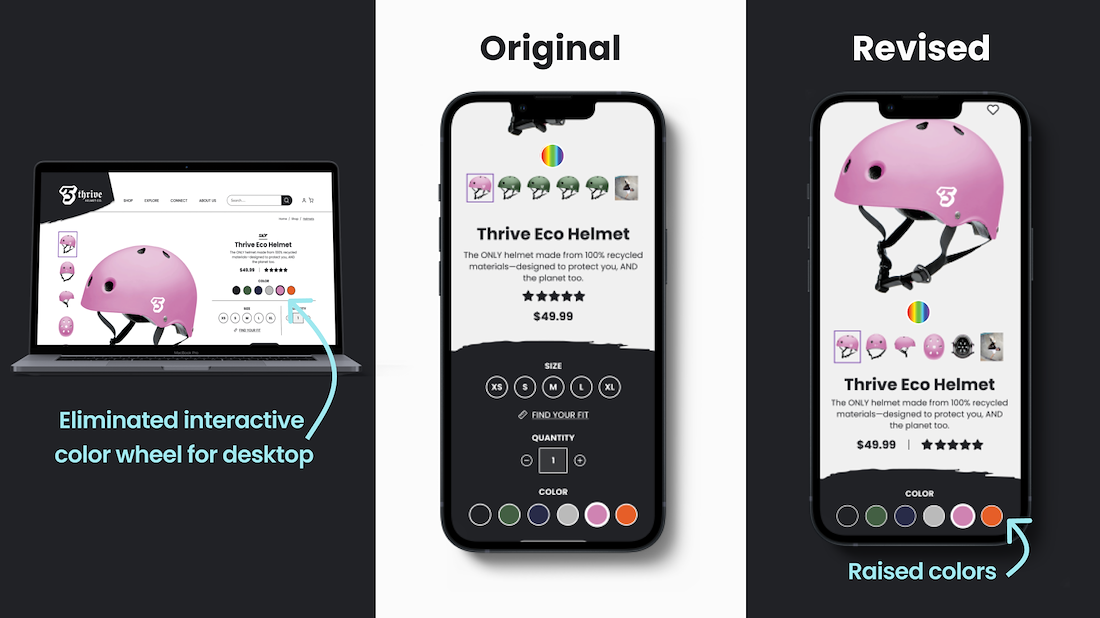
On the mobile version, we added an interactive color picker that we wanted to get feedback on. Users said the color picker was “very easy” and that they had “so much fun”. For those that did not use it, we moved the other color options up higher so they wouldn’t have to scroll back and forth as they changed color.
/background(fff)/1100x618.jpeg?auto=webp)
/background(fff)/1100x618.jpeg?auto=webp)
Scroll through to see user testing results
/background(fff)/1100x618.jpeg?auto=webp)
/background(fff)/1100x618.jpeg?auto=webp)

NEXT STEPS
• Further research and build out the community channel
• Continue building out the explore channel
• Create additional elements such as: log in screen, profile, reward system,
shopping cart, and a way to invite a friend

/background(fff)/1920x1080.jpeg?auto=webp)