A local online small business who needed
help updating their existing e-commerce shop.
PROJECT NAME DiscoBrooklyn
ROLE Project manager/UX/UI Designer
DATE 12/20/2022
THE CHALLENGE
A concept project as part of the General Assembly UX Immersion. I was tasked to create an improved eCommerce website so the client could increase conversions (sales) and make their e-commerce experience more user-friendly. The owners communicated that they built their own website but were not pleased with the results. They had plenty of website visitors yet few completed purchases.
ROLE, SCOPE & CONSTRAINTS
This was a solo project where I completed all UX/UI deliverables including research, design, testing, iterations and final prototype in a two week design sprint. My eCommerce site had to include:
- ● Updated product categories and top-level navigation.
- ● Have a product description page for one product.
- ● High-fidelity desktop prototype.
- ● An about Page
- ● Provide information about the store.
- ● Business contact information.
- ● Navigation Pages
APPROACH
I utilized the “double diamond” UX process to develop an overall plan. With quick iterations based on user testing, I was able to adjust the project as I worked.
- Heuristics analysis: 1
- User Interviews: 5
- Card Sorts: 1 Open, 1 Closed
- Usability Tests: 2 Rounds of Testing with 6 Users
RESULTS
- I created a high fidelity working prototype in Figma which includes all of the above requirements and more importantly, improves the look and user experience of the site.
RESEARCH & DEVELOPMENT
I looked carefully at the comparative category navigation options and checked out their flows to develop DiscoBrooklyn’s streamlined site. I began my research for this project by studying a wide variety of comparable tween websites such at B’tween, Claire’s and Brandy Melville. Other successful eCommerce websites, such as TheGap and J.Crew helped guide my thinking for what Disco might need in terms of creating clear and easy navigation. The most successful competitive websites featured an easier navigation and search architecture with easily viewed and informative item descriptions. My challenge became how to integrate all of the best features of these sites, but for a small business.

Disco did not fair well in ease of navigation and product details.

BOOKING & CONTACT
Following this analysis, I conducted interviews with 6 potential shoppers who either had a tween/s or often shopped for them . My users were in agreement that this site was not easy (or pleasant) to use. The navigation bar had too many categories and most users wanted to go straight to the search tool. But, everyone loved the unique vibe and curation of their local tween store and wanted those feelings to carry to the website. This led me to narrow my focus and ask, how might I make a tween eCommerce site that would please locals who want to support a local business and know the e-shopping experience will be easy to navigate and inspirational to enable a purchase to be made?

The main takeaways were divided into 2 main categories, navigation issues and the overall aesthetic.
BOOKING & CONTACT
In order to assess the current experience of the site I evaluated the user interface against Nielson’s set of heuristic principles.
Here were my main takeaways from the heuristics analysis.
1. Navigation Bar Too many options (17), on three lines. Difficult to match products with options presented. Brand names category is too disorganized. “Boys” and “girls” category is confusing. They are only for clothing. “Gifts” has 67 pages under the (mismatched) title of “Gifts & Goodies.” Gifts includes everything ranging from jewelry, books and bags, to candy. stickers and pool floats.
2. Product page Not enough details about the product. No add to wishlist. No breadcrumbs, see next.
3. Breadcrumbs Inconsistent. When doing a search for a product, led to the product page without a breadcrumb therefore no way of finding out what category this product comes under.
4. Help No help button. No FAQ option. No contact us (except for provided address and phone number). No email at all
5. Aesthetic Text on home page is very difficult to read.
After finishing my research I narrowed the navigation categories down using a sample inventory list through open and closed card sorts (using Maze). This helped me understand the categories and confusing product names that were mixed in with them.
16 categories total.

Had to think about narrowing down the categories from 16 to 6.
PERSONA & PROBLEM STATEMENT
Meet Sarah! To gain more insight, I developed this persona based on research, this is who would want to shop at a unique tween store such as Disco.

BOOKING & CONTACT
My problem statement evolved to the following:
Sarah has difficulties looking for what she needs on the disco website. The navigation and IA needs to be refined so she can easily find the products she needs to give as gifts for the tweens in her life.
USER FLOW
Every user I interviewed commented on how so many category options are overwhelming. The categories were also inconsistent, some referred to brand name items, there is a boy/girl category, but only limited to some items. There was also no quick help option. A customer that needed help for a purchase did not have easy access for assistance. In fact, there is no email address provided, only a phone number (think, only office hours, not helpful for busy Jill if she needs help).
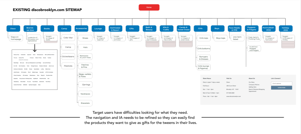
Here is the existing sitemap. Please scroll for the proposed.
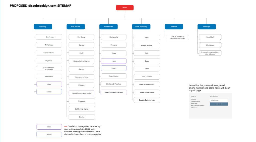
DESIGN ITERATIONS
How will these pages retain a visitor to the site and entice them to stay to make a purchase? Simplify. I sketched out some general landing page ideas.
The aim was to make the home page a much more inviting, less chaotic experience for the user. I also wanted to address the ease of shopping in general. I then thought about the general flow of a purchase.
Questions I tried to answer with my initial sketches:
• How can I integrate the 6 categories and simplify the composition for a more pleasant user experience.?
• How do I gear this site toward the buyers ease of use?
• How do I design a more a professional user-friendly site that allows a quick search , and the much needed information for products followed by a purchase?

My first round of sketches for the project. I was searching for a way to make the current site simpler and easier to browse and navigate. Aesthetics also played a large part, simplification was the goal.

Drop down sub category under “Brands we love”. All users responded to this as unordered and would not be able to find a brand quickly. There are repeated brand names and they are not alphabetized. I needed to organize this!

BOOKING & CONTACT
I got to work on the wire framing and the general design of the pages. I really wanted to make sure there was detail (of the products) added to the product pages. The users were surprised to find there was no information provided. Below is an example close up… I checked the Rowdy Sprout website, they mention the place where they are made and printed, the fabrics used. They also provide a few lines describing it.


A snapshot: Logo inquiry and image exploration.
USER TESTING
I created a Maze test that had 10 testers with a 90% success rate. The users utilized my recommended flows and the heat maps were clicked in the right places except for the checkout page. There was some confusion with the payment method. I have decided to flip the buttons. It is more important to notice the payment methods first, before the option to “Check out” My next steps from here would be to develop the Disco logo further.

Prototype.